
Business Cards: 7 Mistakes to Avoid Before Printing
- 04 Jun, 2026
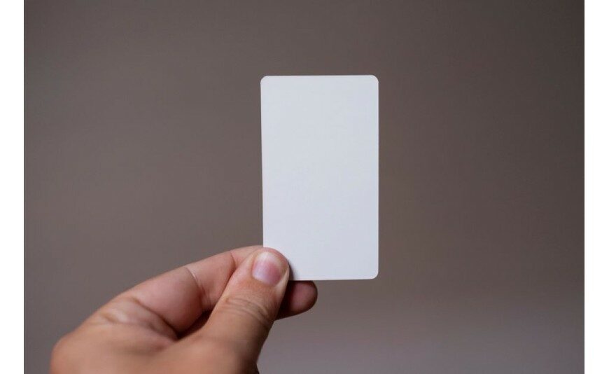
A business card fits in the palm of your hand, but it says a lot about how seriously you take your business. A few square centimetres where every detail counts: a blurry image, text clipped by the guillotine, or paper that curls, and your whole first impression suffers. The good news is that the most common mistakes are also the easiest to avoid. Here are the 7 mistakes that crop up most often in business card print files, and how to fix them before the run.
1. Forgetting the Bleed
This is the number one mistake. The bleed is the overflow zone (usually 2 to 3 mm) where your colours and images extend beyond the final trim size. Without it, the slightest shift during cutting reveals a thin white line along the edge. The fix: extend any element that touches the edge right into this margin, and keep text 3-4 mm inside the trim size, within the safety zone, so it's never at risk of being cut off.
2. Working in Low Resolution
An image grabbed from a website or pulled from an email looks fine on screen… then comes out pixelated when printed. The rule is simple: every visual should be 300 dpi at its actual print size. A logo, ideally, should be supplied as a vector file (EPS, PDF or SVG): it stays sharp whatever the size. Avoid enlarging a small image: doing so doesn't create detail, it just stretches out the blur.
3. Trying to Fit in Everything
It's tempting to squeeze in a mobile number, a landline, two email addresses, your postal address, your website, four social media handles and a slogan. The result: a cluttered, illegible card where the eye doesn't know where to land. An effective business card sticks to the essentials:
- Name and job title, clearly identifiable;
- The logo or company name;
- A single phone number, the one people should actually call;
- An email address and a website, without stacking up every channel;
- White space, which lets the card breathe and makes everything else stand out.
If an element doesn't help a contact reach you, it's just clutter. Better to leave it out.
4. Neglecting Contrast and Readability
Light grey text on a white background, a tiny typeface for the sake of elegance, a name set at 6 point "to look sleek": these are all choices that condemn your card to the bottom of a pocket, unreadable. Aim for strong contrast between text and background, and don't go below 7-8 point for information that needs to be read. Stick to two typefaces and two or three colours: restraint reads better and always looks more professional than overdoing it.
5. Choosing Paper That's Too Thin
A card that bends under your fingers or curls up sends a message of flimsiness. Paper weight makes a real difference: below 300 g/m², a business card lacks substance. Aim for 350 g/m² or more for a reassuring feel in the hand. This is also the moment to think about finishes — soft-touch lamination, hot foil stamping, spot varnish — all skills covered by our card and stationery printing service. Quality paper gets noticed from the first handshake.
6. Forgetting the Back
Many people leave the back blank "to keep it clean". That's free real estate going to waste. Without overloading it, the back of a card can hold a QR code, a slogan, a brand visual, your opening hours, or a space to jot down an appointment. Do bear in mind, though, that you'll need an uncoated paper if you want to write on it with a pen: a glossy lamination stops ink from taking at all. Front and back should stay consistent, within the same visual identity.
7. Not Testing Your QR Code
The QR code has become a back-of-card classic, and it's also a trap. A code that's too small, reversed in contrast (light on a dark background), placed too close to the edge, or pointing to the wrong URL, becomes useless once printed. Before signing off, physically scan your code with several phones, check that it leads to the right page, and leave a margin of space around it. A QR code that doesn't work is worse than no QR code at all.
The Right Habit: A Professional Eye Before Printing
Most of these mistakes can be spotted in a few seconds by an experienced eye. At 2M Numérique, our in-house graphic design studio checks your files, adjusts bleed, resolution and contrast, and sends you a proof before any printing. From our workshop in Manciet, at the heart of Armagnac, we produce the vast majority of your orders on-site (94% of 2024-2025 volumes) and 100% in France, under the "Made in Occitania" label. A single point of contact follows your project from consultation to delivery, anywhere in France and Europe. Getting your business cards ready? Tell us about your project: your free quote reaches you within 72 hours. A well-designed card is a successful first impression.
Further reading
- 30 Jul 2026Signage and window graphics regulation: 2026 guide (Gers, Landes)
- 01 Jul 2026Mandatory Notices on Your Printed Materials | 2M Numérique
- 04 Jun 2026When Should You Order Your Print? The Lead Time Guide
- 04 Jun 2026Cotton, Polyester or Organic: Choosing Your Custom Fabric
- 04 Jun 2026Adhesive Labels: Paper or Vinyl, How to Choose
 Français
 English
 Español