
Getting your logo right: the basics of an effective visual identity
- 01 Jun, 2026
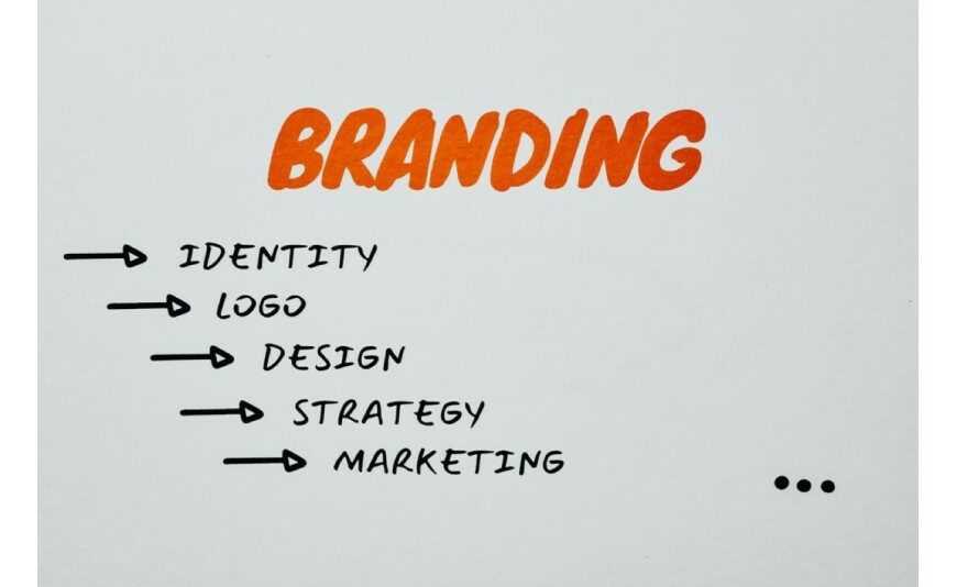
Your logo is the face of your business: it appears on your cards, your signage, your vehicle and your social media. All the more reason to get it right. Here are the principles we apply in our studio to create identities that stand the test of time.
Simplicity above all
The strongest logos are simple: they're recognisable at a glance and stick in the memory. Too much detail gets lost at small sizes (a card, an app icon) and becomes tiresome over time.
Legibility at every size
A good logo works just as well on a 3-metre sign as it does on a pen. We always test it very small and in black and white: if it still holds up, it's a winner.
Adaptability
Colour version, monochrome, light background, dark background, square format for social media… A well-designed logo plans for its variations so it stays flawless everywhere.
A consistent visual world
The logo is just the beginning: colours, typefaces and style come together to form a complete visual identity, which we then carry across all your materials for a recognisable image.
Thinking about print from the start
Working with a printer-designer means making sure your logo looks just as good printed as it does on screen (colours, bleed, vector artwork). Our graphic design studio creates or redesigns your identity. Let's talk about your project.
Further reading
- 30 Jul 2026Signage and window graphics regulation: 2026 guide (Gers, Landes)
- 01 Jul 2026Mandatory Notices on Your Printed Materials | 2M Numérique
- 04 Jun 2026Roll-Up or Kakemono: Which One for a Stand?
- 04 Jun 2026Rigid Panel or Banner: Which Outdoor Material?
- 04 Jun 2026Adhesive Labels: Paper or Vinyl, How to Choose
 Français
 English
 Español