
Pantone, CMYK, RGB: Understanding Colour in Print
- 04 Jun, 2026
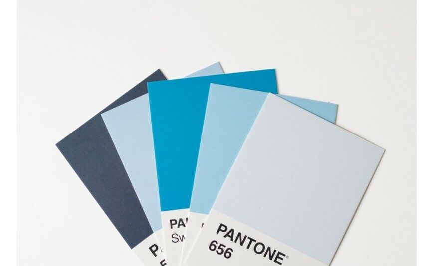
You approved a vivid red on screen, and the printed version looks duller? That's not a printing fault: a screen and a sheet of paper simply don't make colour the same way. Understanding the three key references — RGB, CMYK and Pantone — will save you plenty of surprises and help you get materials that stay true to your image. Here's a clear rundown for businesses and individuals across the Gers and the Landes.
RGB and CMYK: Two Worlds, Two Logics
RGB (Red, Green, Blue) is the language of screens. It works through additive synthesis: you start from black and add coloured light to build up each shade. The more you add, the closer you get to white. It's luminous and very wide-ranging, but it only exists on a backlit screen.
Printing, on the other hand, speaks CMYK (Cyan, Magenta, Yellow, Key/black). It's a subtractive process: on a white sheet, each layer of ink absorbs part of the light and reflects the rest. The more ink layers you stack, the darker it gets. Colour isn't added, it's subtracted. Two opposite logics, for two very different media.
Why Colour Changes from Screen to Paper
Screens cover a wider palette than the four CMYK inks can reproduce. Some highly saturated shades — electric greens, deep blues, fluorescent oranges — exist in RGB but fall outside the gamut (the range of reproducible colours) of print. When printed, they're pulled back to the nearest printable shade, which softens them. A few practical factors add to this:
- The paper: a glossy coated stock makes colours punchier, while a matte or recycled paper tones them down.
- Ambient light: the same sheet looks different under strip lighting, daylight or a warm lamp.
- Your screen settings: brightness and calibration have a huge effect on what you think you're seeing.
A screen is therefore only ever a guide — never an exact promise of the printed result.
Pantone Spot Colours: Guaranteed Consistency
For colours that can't tolerate any variation, there's another approach: Pantone spot colours. Instead of recomposing a shade from the four inks, you use a pre-mixed ink that's identical from one print run to the next. The blue in your logo will be exactly the same this year as next. Pantone earns its keep in several situations:
- Solid brand colours: a signature colour kept rigorously consistent across all your materials.
- Shades outside the CMYK gamut: certain bright or pastel tones that four-colour process printing simply can't reproduce cleanly.
- Special effects: foiling, fluorescent and metallic inks (gold, silver, copper) that add a dimension no CMYK mix can simulate.
The trade-off is that a spot colour adds an extra ink to the run and comes at a cost: it's best kept for elements where accuracy or effect justify it, such as a premium business card or a prestige brochure.
Preparing Your File Properly: CMYK First
The single most useful piece of advice: supply your file in CMYK, not RGB. An RGB file has to be converted before printing, and that automatic conversion can spring nasty surprises on saturated shades. By switching to CMYK yourself at the design stage, you see the real result from the outset.
The colour profile plays a key role here: it's your file's colour identity card, describing how each shade should be interpreted by the press depending on the paper type. The right profile guarantees that everyone — you, your designer, the printer — is talking about the same colours. If these settings feel daunting, our graphic design studio prepares and checks your files before printing.
The Proof: Approving Colour Before You Print
No strategically important colour should go to print without a proof (BAT, "bon à tirer"): the sign-off document, ideally a contractual one, by which you approve the file just before the run starts. When colour accuracy matters, a printed proof beats an on-screen approval every time: you're judging the shade on the actual material.
To keep to a brand guideline, a few habits help: give your exact references (CMYK codes and, where relevant, Pantone) rather than a colour matched "by eye", group your materials together to set the colour once, and keep a reference printout for reorders. That's exactly the value of a single point of contact from consultation to delivery: for your commercial print materials — flyers, leaflets, posters or catalogues — they know your brand guidelines and guarantee the same colour from one run to the next.
Accurate Colour, from the Gers to the Landes
Based in Manciet (32), a workshop certified Made in Occitania, we produce the vast majority of your orders on-site (94%, 2024-2025 figures) and 100% in France. Part of our job is also to help you avoid these colour pitfalls: advice on the profile, file checks, a proof to approve a sensitive shade. Whether you're a shop, a tradesperson, a winemaker or an association near our print shop covering Mont-de-Marsan, let's talk about your project: we'll put together a free quote within 72 hours and deliver anywhere in France and Europe. Trust us with your colours — they'll be spot on, on screen and on paper alike.
Further reading
- 30 Jul 2026Signage and window graphics regulation: 2026 guide (Gers, Landes)
- 01 Jul 2026Mandatory Notices on Your Printed Materials | 2M Numérique
- 04 Jun 2026When Should You Order Your Print? The Lead Time Guide
- 04 Jun 2026Cotton, Polyester or Organic: Choosing Your Custom Fabric
- 04 Jun 2026Business Cards: 7 Mistakes to Avoid When Printing
 Français
 English
 Español